Verdancy - Undergraduate Capstone
A website focused on gardening with environmental impacts
A website focused on gardening with environmental impacts
Duration
6 months (Jan - June 2021)
Skills
Cross Functionality, Presentation Skills, Wireframing
6 months (Jan - June 2021)
Skills
Cross Functionality, Presentation Skills, Wireframing
Tools
Figma, Miro, React.JS
Team
Ana de las Alas, Jared Lai, Anna Zhou
Figma, Miro, React.JS
Team
Ana de las Alas, Jared Lai, Anna Zhou
What is Capstone?
Capstone is a cumulative final project for undergraduates in the Information School. Students identify a problem or need, and then develop the approach needed to address the problem, conduct the research and present the findings in both oral and written formats.
Final Proposal
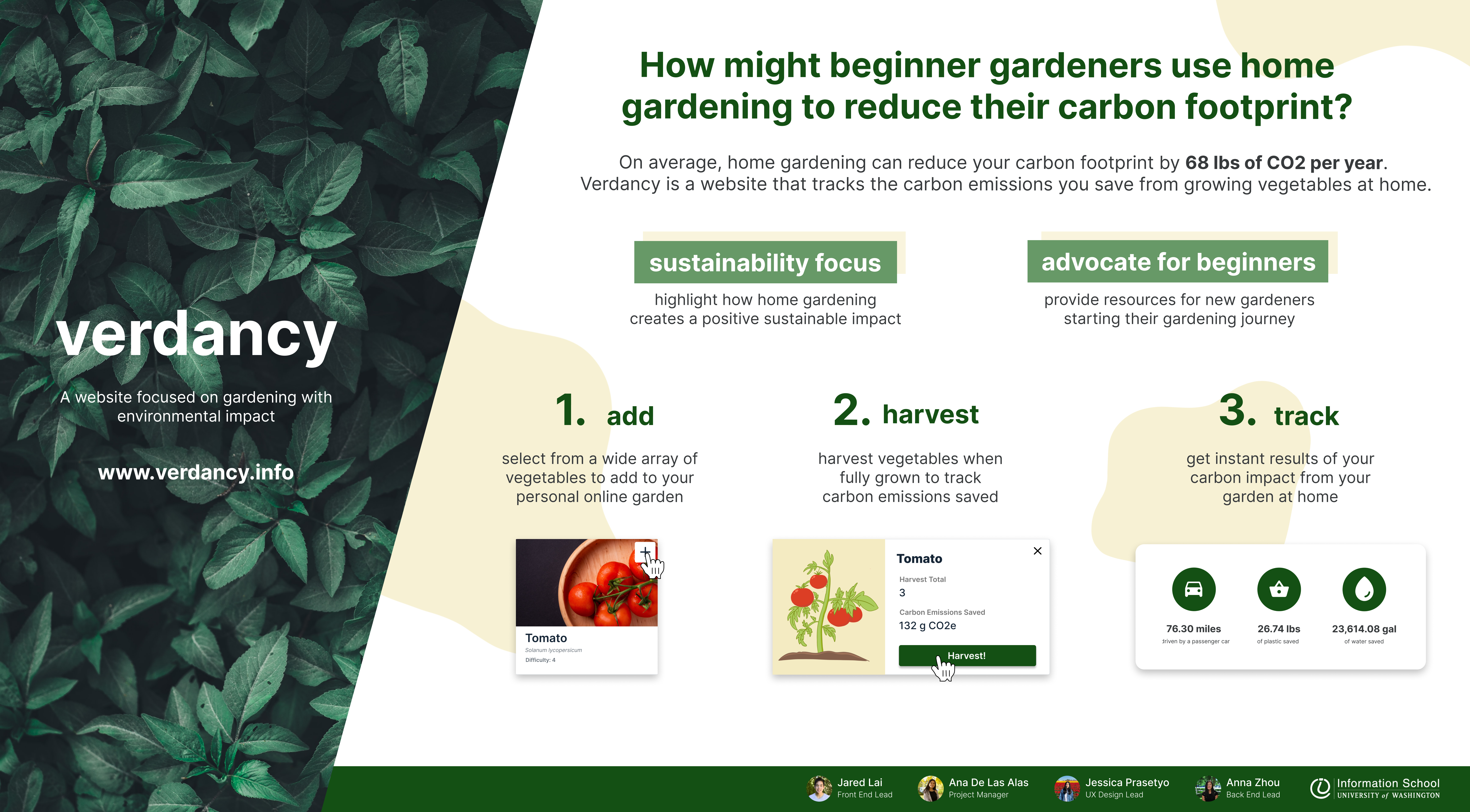
Our team developed a web app aimed at helping beginner gardeners become more aware of their environmental impact at home.
Problem Context
Food production accounts for 25% of the worlds carbon emissions. Although it requires much bigger resources than the average gardener to tackle this problem, gardening and growing your own food has actual shown positive impacts in reducing one’s carbon foorprint for the individual. It has impacted carbon emissions to the point that gardeners can reduce an estimated amount of 68 lbs of CO2e emission per year.
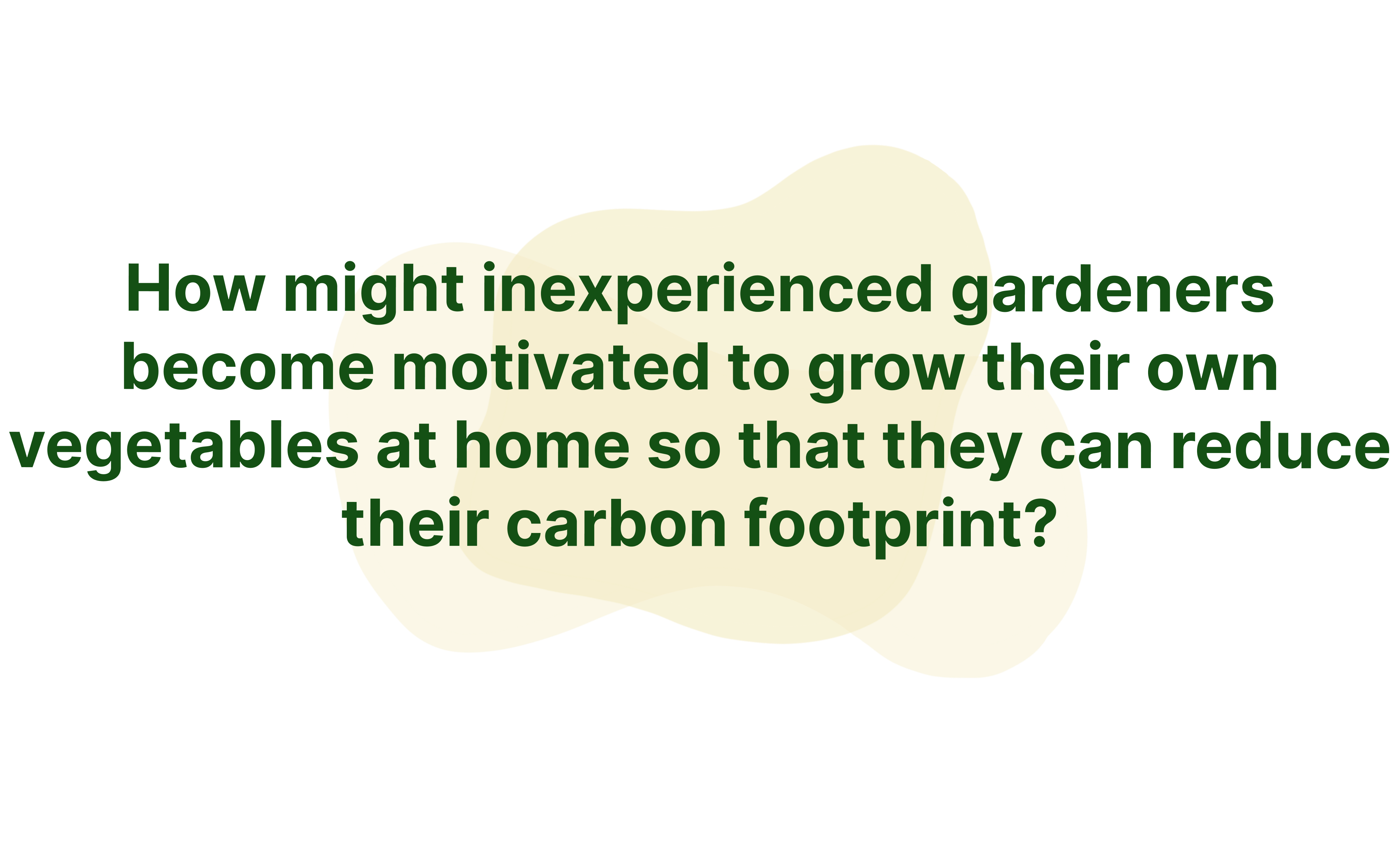
We sought to answer...
Literature Review
We started out doing an extensive exploration on the studies and observations about gardening and its benefical impacts. Following this was market research, where we explored exisiting apps and products that were related to our problem statement.
![]()
![]()
![]()
We started out doing an extensive exploration on the studies and observations about gardening and its benefical impacts. Following this was market research, where we explored exisiting apps and products that were related to our problem statement.
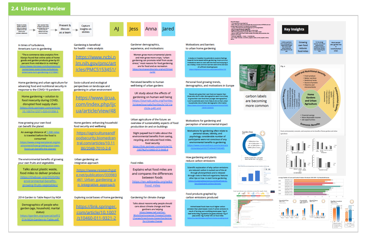
Research Insights
We summarized our research to three insights that correlated to each of the three types of research that we had conducted.
![]()
Overall, we found that gardening has many positive benefits and can both impact people and the environment, but there aren’t any existing solutions that bridge these two topics together.
We summarized our research to three insights that correlated to each of the three types of research that we had conducted.
Overall, we found that gardening has many positive benefits and can both impact people and the environment, but there aren’t any existing solutions that bridge these two topics together.
Solution Approach & Key Features
Seeing the gap between personal gardening and environmental impact, we wanted to create some bridge in bringing those two ideas together. We wanted to advocate gardening with a sustainable focus, and do it in a way that advocated for beginners.
design exploration
Once we had solidified the main features that we wanted to implement, it was time to start thinking about design.
We opted to stick to a more simple and blockish design, similar to the Bootstrap format. This would make it easier for the developers to plan ahead and have an easier time visualizing when building the product. We focused on our design to be information driven and easy for beginners in gardening.
![]()
Once we had solidified the main features that we wanted to implement, it was time to start thinking about design.
We opted to stick to a more simple and blockish design, similar to the Bootstrap format. This would make it easier for the developers to plan ahead and have an easier time visualizing when building the product. We focused on our design to be information driven and easy for beginners in gardening.
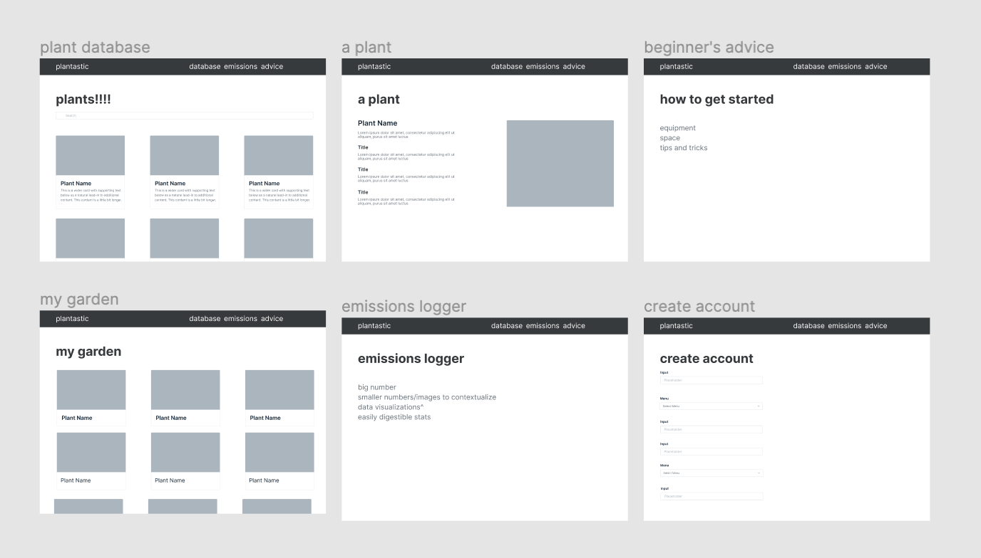
Design Concept Validation
search through database
look for vegetables that you are interested in growing and learning more about
![]()
create customized gardens from personal interest
track your growing vegetables online
![]()
User Testing
search through database
look for vegetables that you are interested in growing and learning more about
create customized gardens from personal interest
track your growing vegetables online

User Testing

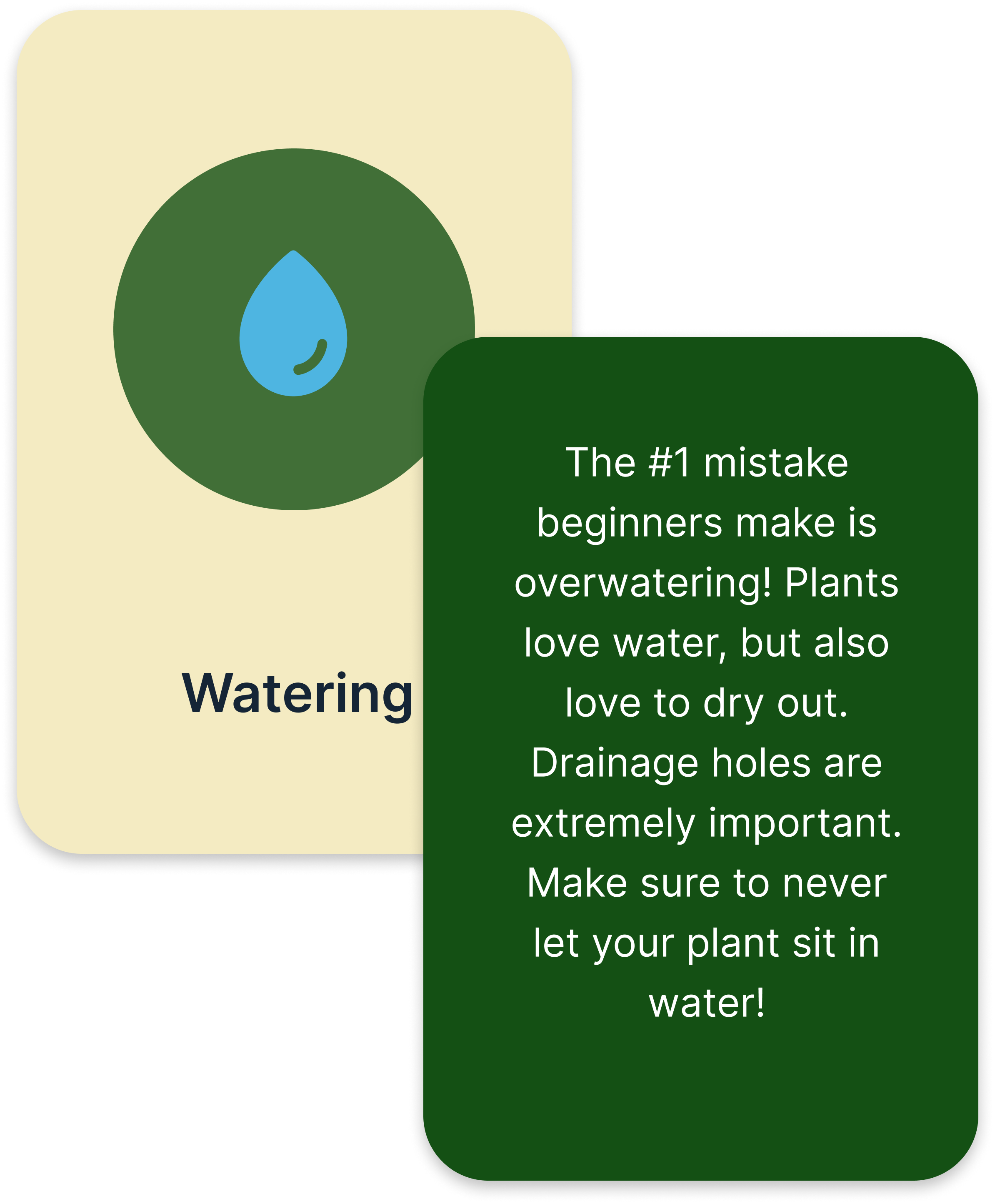
get started with advice cards
If not sure where to start, advice cards can give you the need to know basics

learn from real time emissions impact
see how much carbon emissions you save when growing them
We went through multiple iterations of user research to validate three main concepts that were seen as shaky from our users.
1. Carbon Emissions
Gauge whether users understood what gCO2e meant
2. gCO2e Comparisons
Capture how users contextualize large carbon emission values
3. My Garden Functionality
Test the intuitiveness of adding and harvesting plants within My Garden
Professor + Class Feedback Cycle
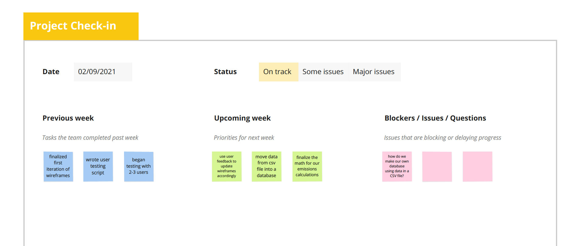
Throughout the duration of out capstone project, our team would meet weekly with our Capstone class. Throughout the iterative design process, we could get feedback on our current outlines and designs with our professor and fellow classmates. This gave us time to reflect and iterate every week and we would be able to plan ahead for the next upcoming weeks.
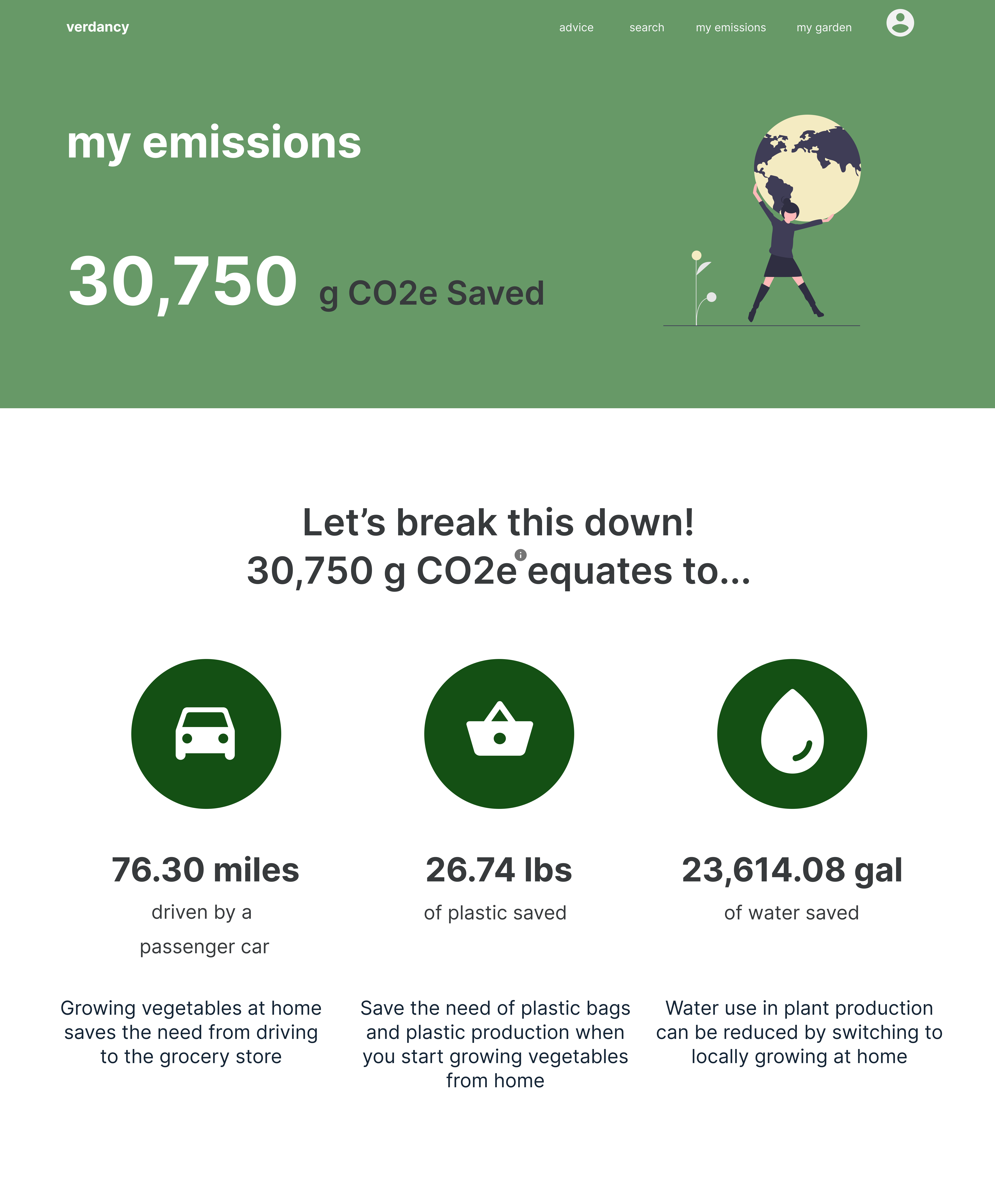
Final Product
![]()
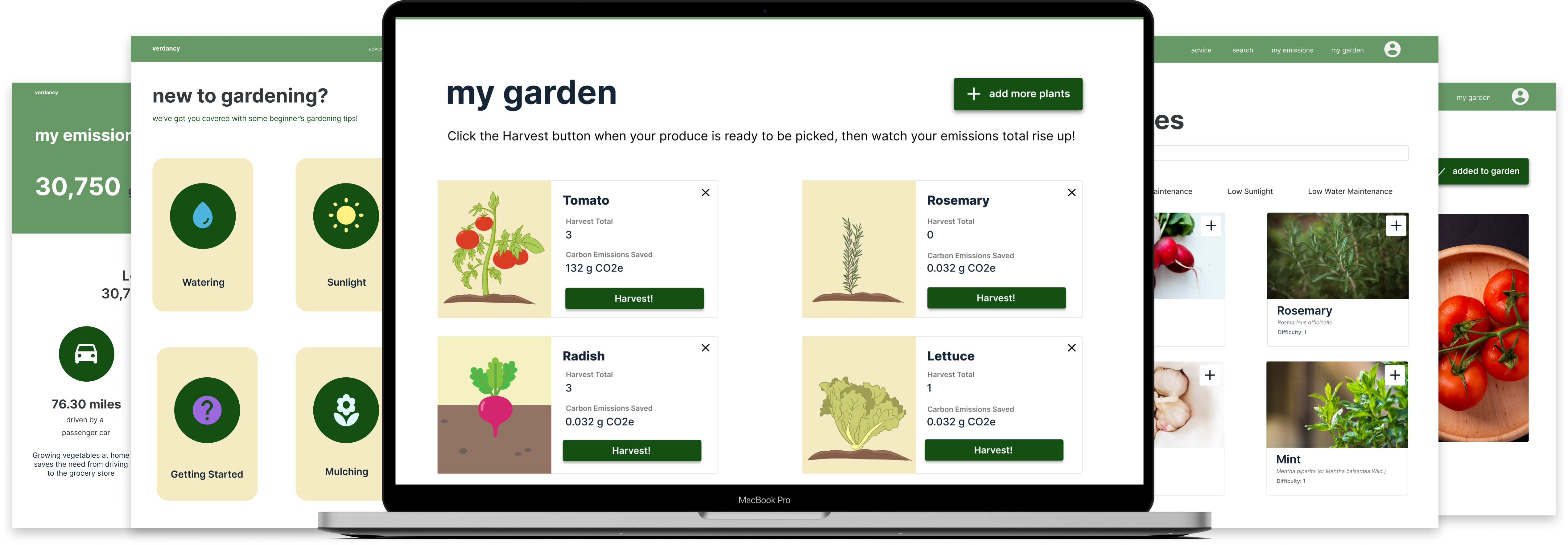
Gardening at home can offer huge benefits and make a positive impact on your carbon footprint. Verdancy is a place where gardeners and growers alike can keep track of their carbon emissions with the vegetables they grow.
choose what you grow
search through our database to learn more about the vegetables you can plant and harvest


maintain your vegetables online
manage all your vegetables in one place
and log the vegetables you harvest
learn how you make an impact at home
view the carbon emissions you saved and see how easy it is to reduce your carbon footprint
Noticing the gap between environmental impact and home gardening, we sought out to create a space for those to take home gardening to the next level. Our goal is to help you get a personalized understanding of what you grow and how it can leave a positive impact on the world.
We also wanted to build a platform for beginner gardeners in particular, giving them the resources and information they need to be a more successful, more environmentally conscious gardener.
We also wanted to build a platform for beginner gardeners in particular, giving them the resources and information they need to be a more successful, more environmentally conscious gardener.
Product Design - Enrique Redesign
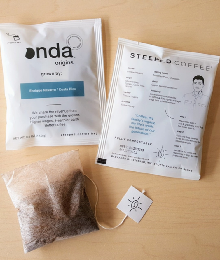
Enrique is a farmer from Onda Origins, who has developed a single serve coffee product with his coffee.
Duration
4 months (Jan - April 2019)
Skills
Product Design, Market and Competitive Analysis, Surveys, Mockups, Usability Testing, Sticky Noting, Collaboration
# of Coffee Breaks Taken
Brew many to count :)
4 months (Jan - April 2019)
Skills
Product Design, Market and Competitive Analysis, Surveys, Mockups, Usability Testing, Sticky Noting, Collaboration
# of Coffee Breaks Taken
Brew many to count :)
Team
Doug Doenges, Luca Freier, Jed Kwek and Taylor Woo
Tools
Adobe Illustrator
Doug Doenges, Luca Freier, Jed Kwek and Taylor Woo
Tools
Adobe Illustrator
Design Process
![]()

Who is Enrique?
Enrique is a single serve product created by the sourcing and roasting startup named Onda Origins. Focused on transparency and authenticity, they believe in shaking up the coffee industry by using innovative blockchain technology to showcase their products.
To do that, they needed their single serve coffee product Enrique to live up to the standards of their mission and their values.
PRESENTED PROPOSAL
A Physical Redesign
Our team revamped Enrique’s physical packaging and gave it a cleaner and more personal look
A Physical Redesign
Our team revamped Enrique’s physical packaging and gave it a cleaner and more personal look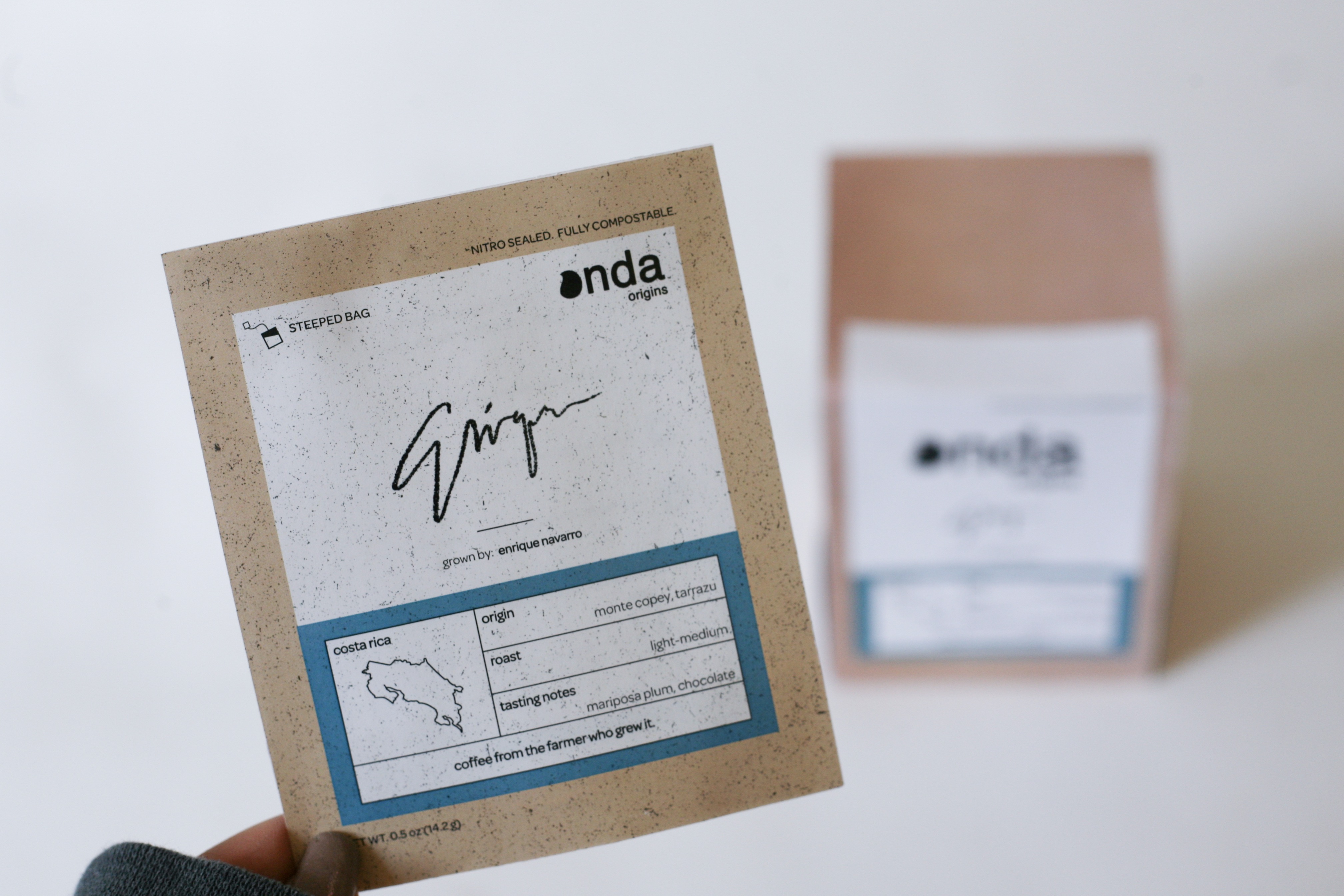

A Personal Digital Experience
We developed an online experience that bridges the physical product and online webpages through the use
of QR technology.
DESIGN QUESTION
How could we redesign Enrique
How could we redesign Enrique
in a way that communicated Onda’s
company mission and establish a
stronger rapport with its customers?
00 - Team Goals
We created two main themes to solidify the main goals
for the upcoming process
COHESION
Improve the integration of the company mission
through the Enrique product
CONSENSUS
Reshape the product experience with the customer
01 - Market Analysis
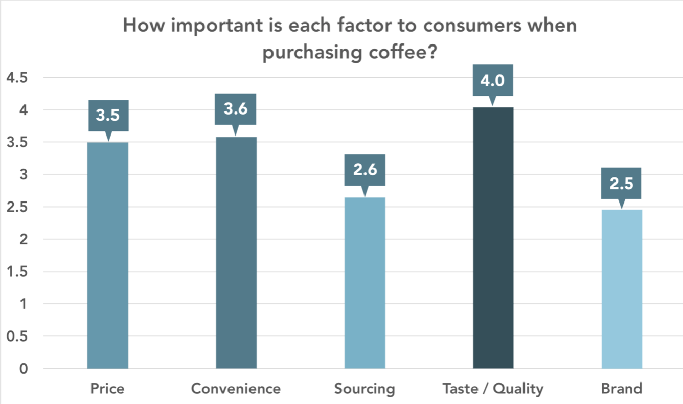
We created a survey asking about coffee behavior and habits, which helped the team understand what kinds of people were drinking coffee, and what were the key factors and competition in the industry.
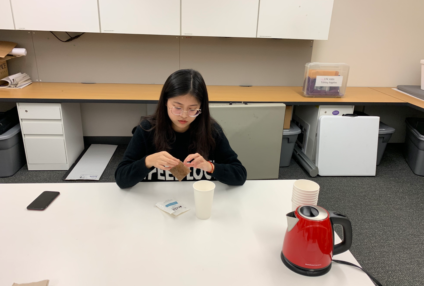
02 - Usability Testing
From the 300+ people that we surveyed, we selected 5 people to interview and conduct usability tests on them. We had them make and then taste the Enrique product, asking questions at each stage of the process.
04 - Findings
We looked for consistent patterns and behaviors that our testers pointed out, and statements that also stuck out as outliers.
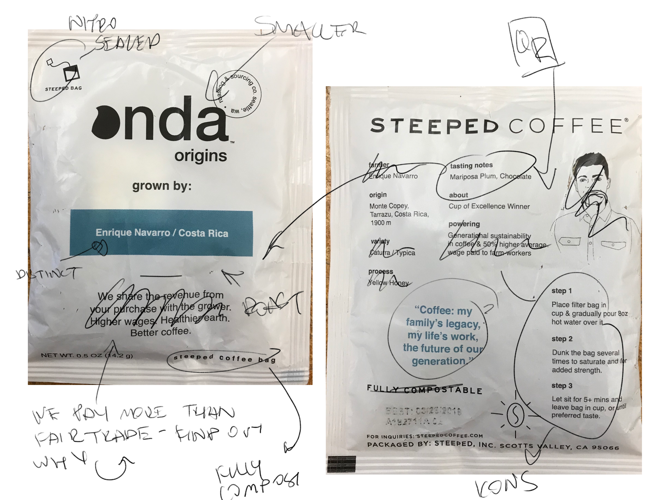
Evidence Should Support Product
The wordings on the packaging felt confusing and misleading. Some felt as if it was disingenuous, comparing many of the phrases on Enrique as a “marketing ploy” or “buzzwords”
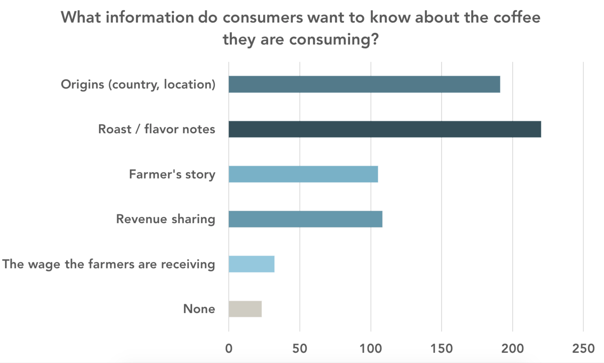
Consumers Want More
Many participants expressed the feeling of wanting to know more about the origins and handling of the product, such as its freshness and roasting details
Taste is King
Taste was seen as the important factor for consumers when considering coffee.
05 - Work out the Good & Bad
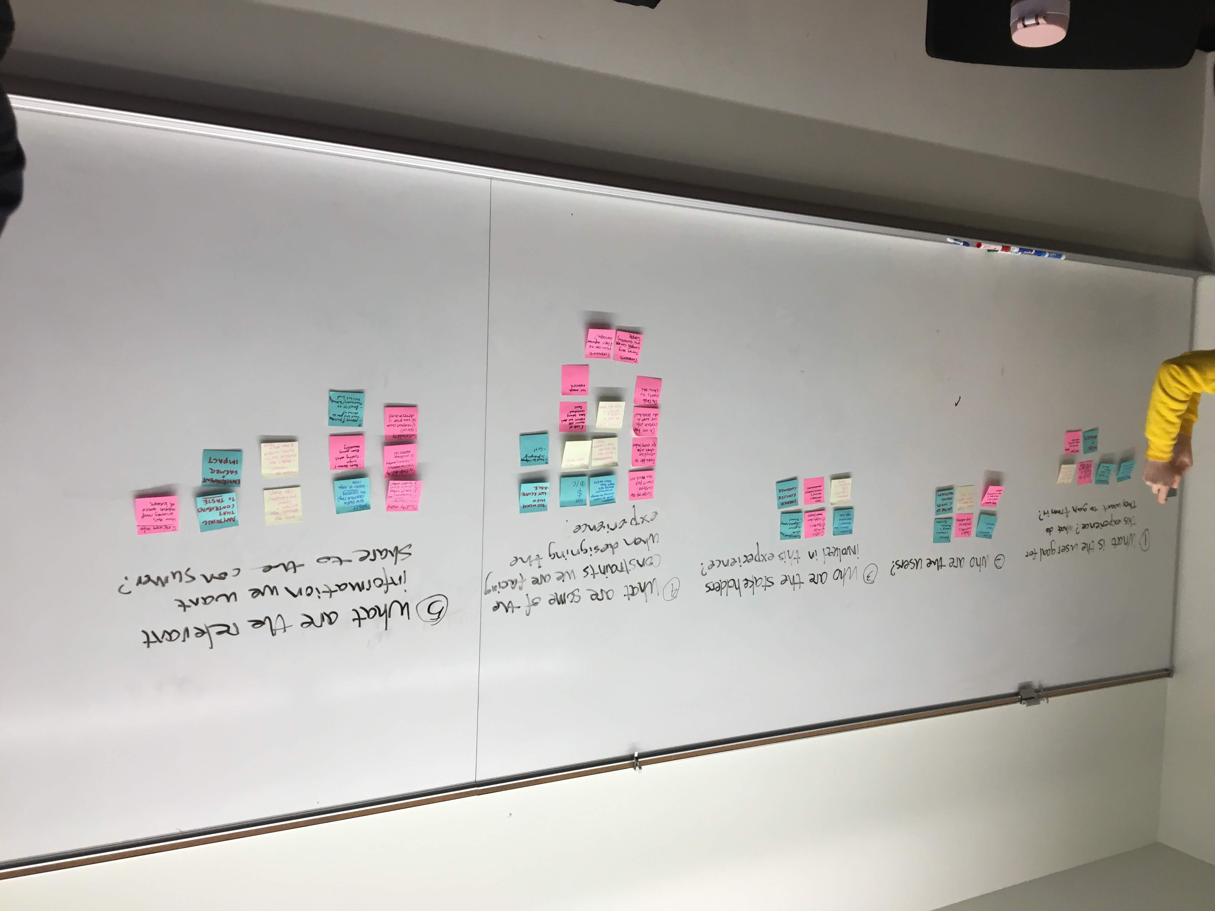
Following the research, Our team held a one day sprint workshop where we analyzed the findings and brainstormed to expand on where we wanted to move forward.
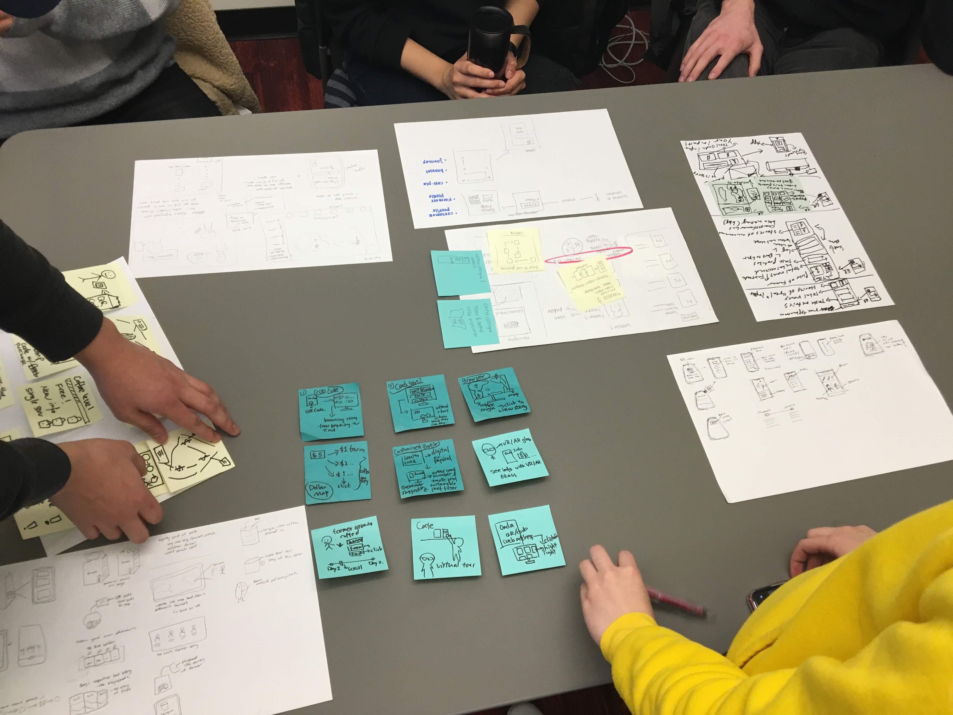
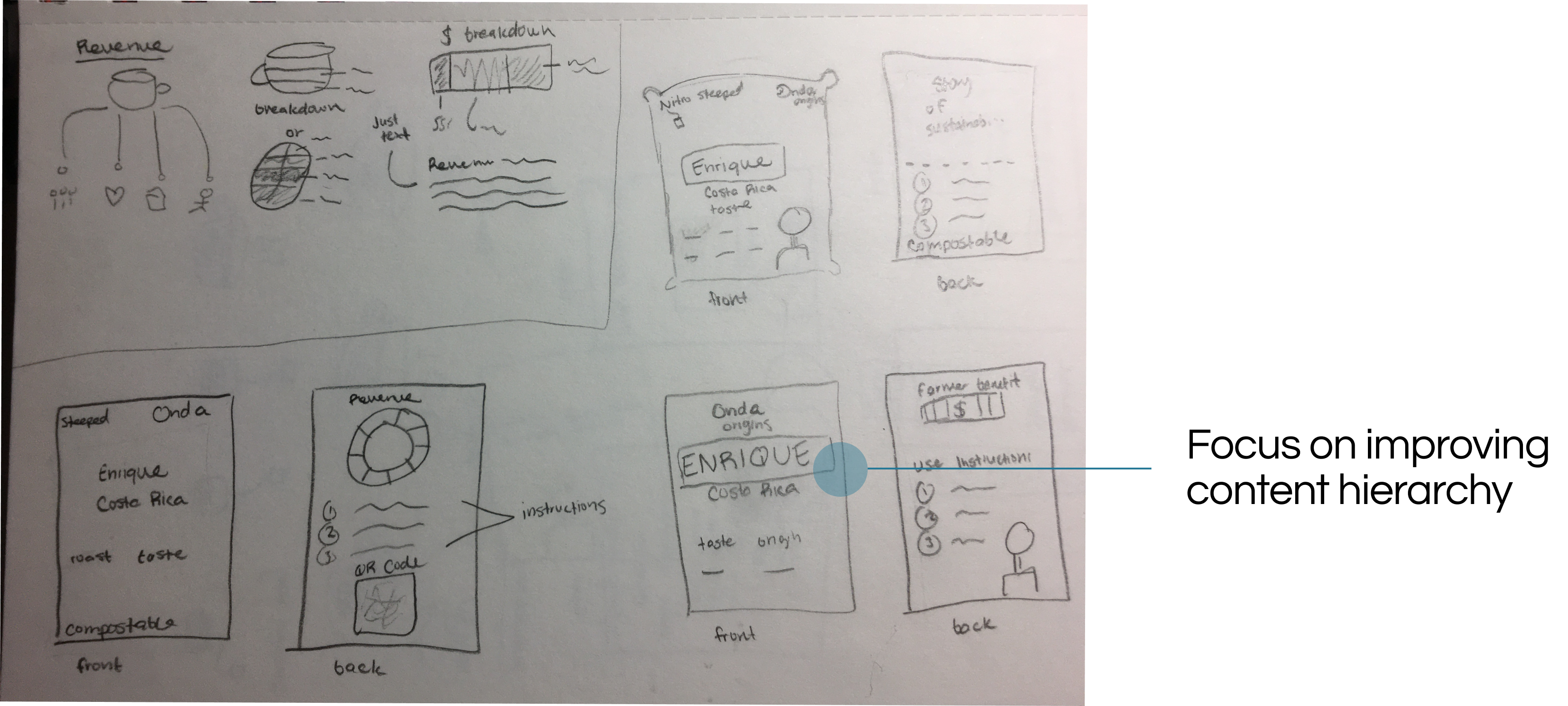
06 - Sketches
Looking at the current product, there were issues that we found that stunted its experience with customers when first interacting with it. When thinking about the redesign, I thought about areas that I wanted to improve within the existing experience.

07 - Mockups
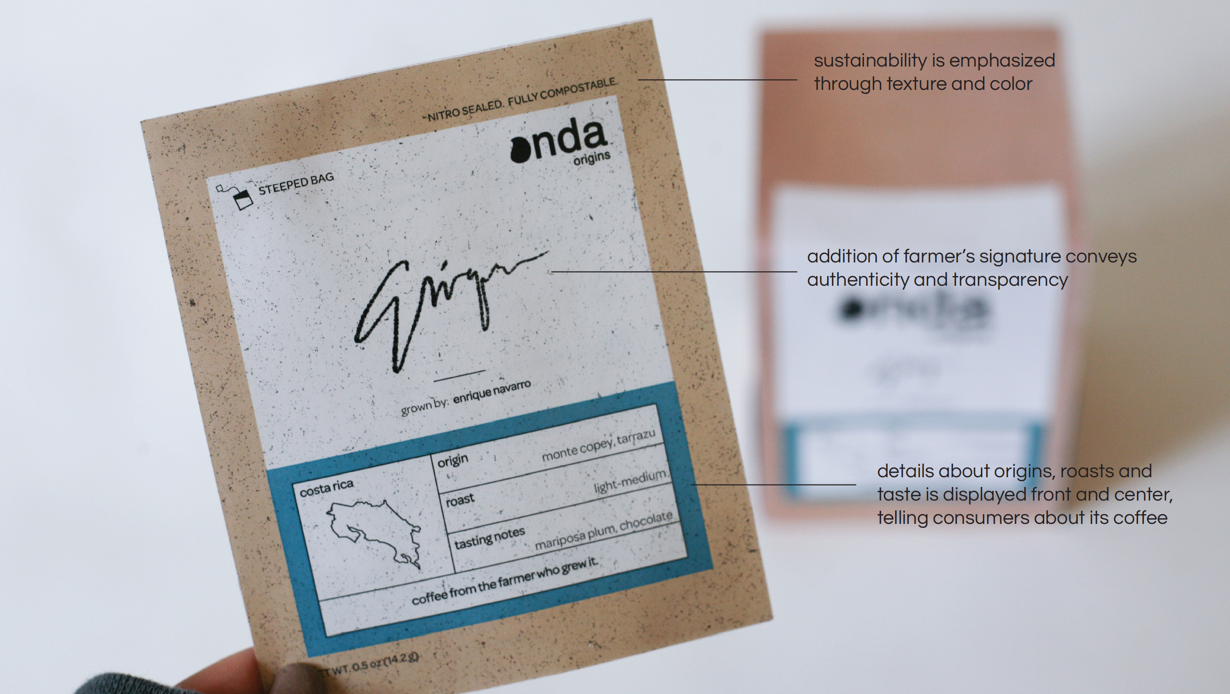
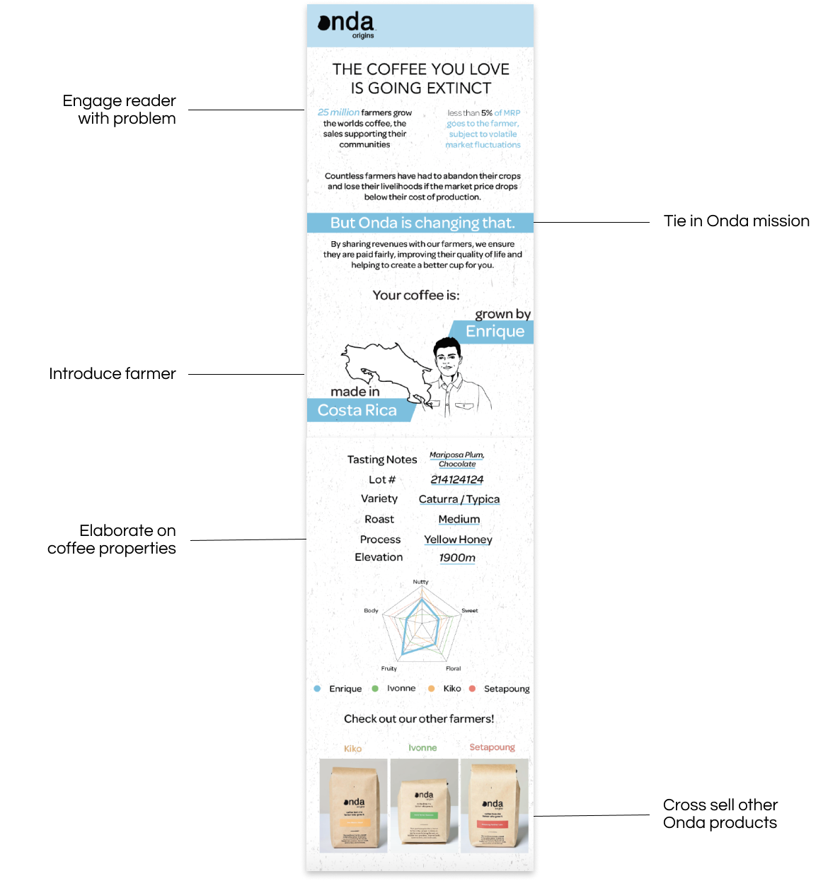
Entice the Customer
On the front of the packet, I wanted it to be able to set up the experience for the user.


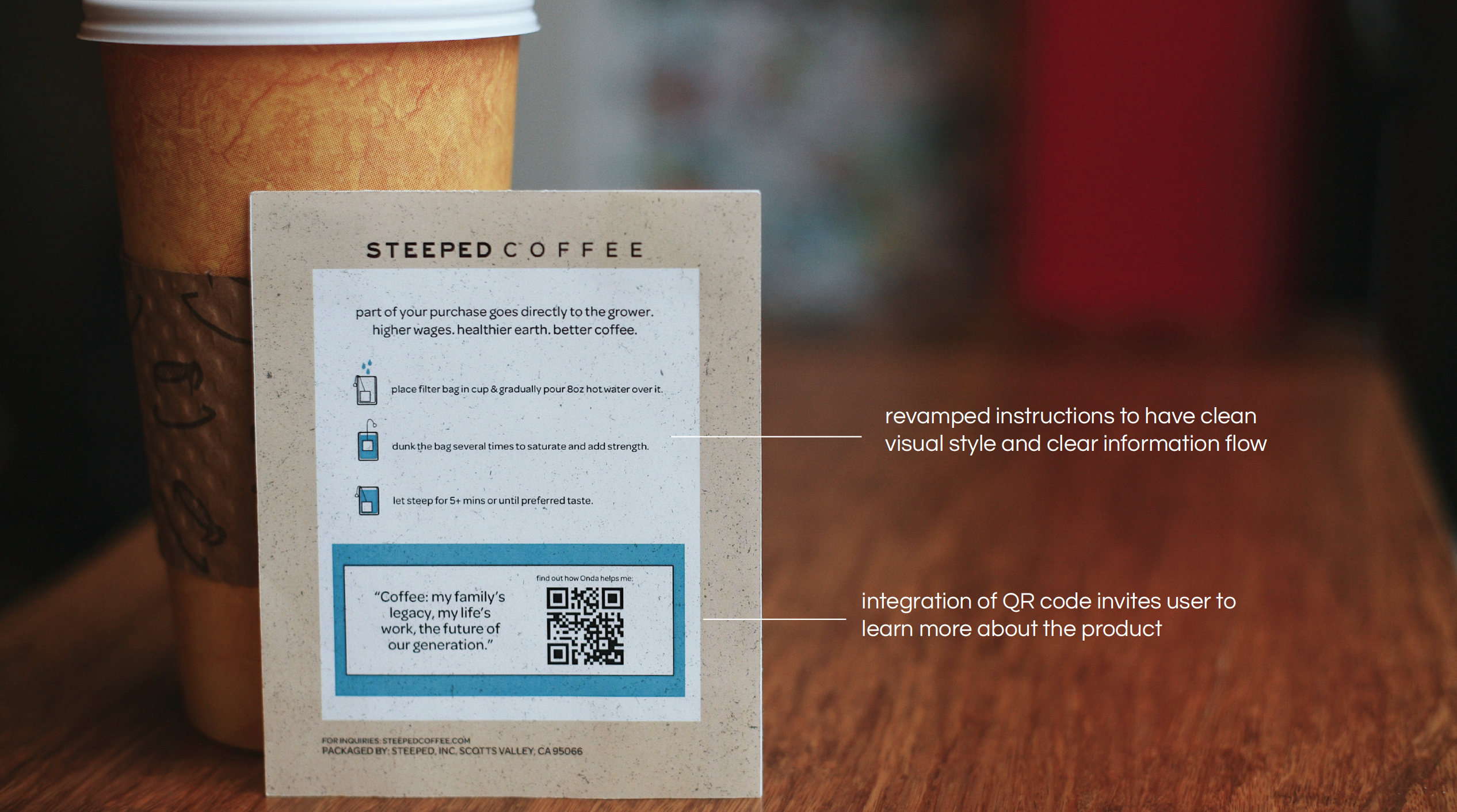
Advocate for the Farmer
The back of the packet should encourage the customer to learn more.
08- Final Design
When building the final mockups for presentation, I saw how rewarding it was to see the full product that we created right in front of my eyes. The following slides below showcase the final designs presented to Onda Origins.
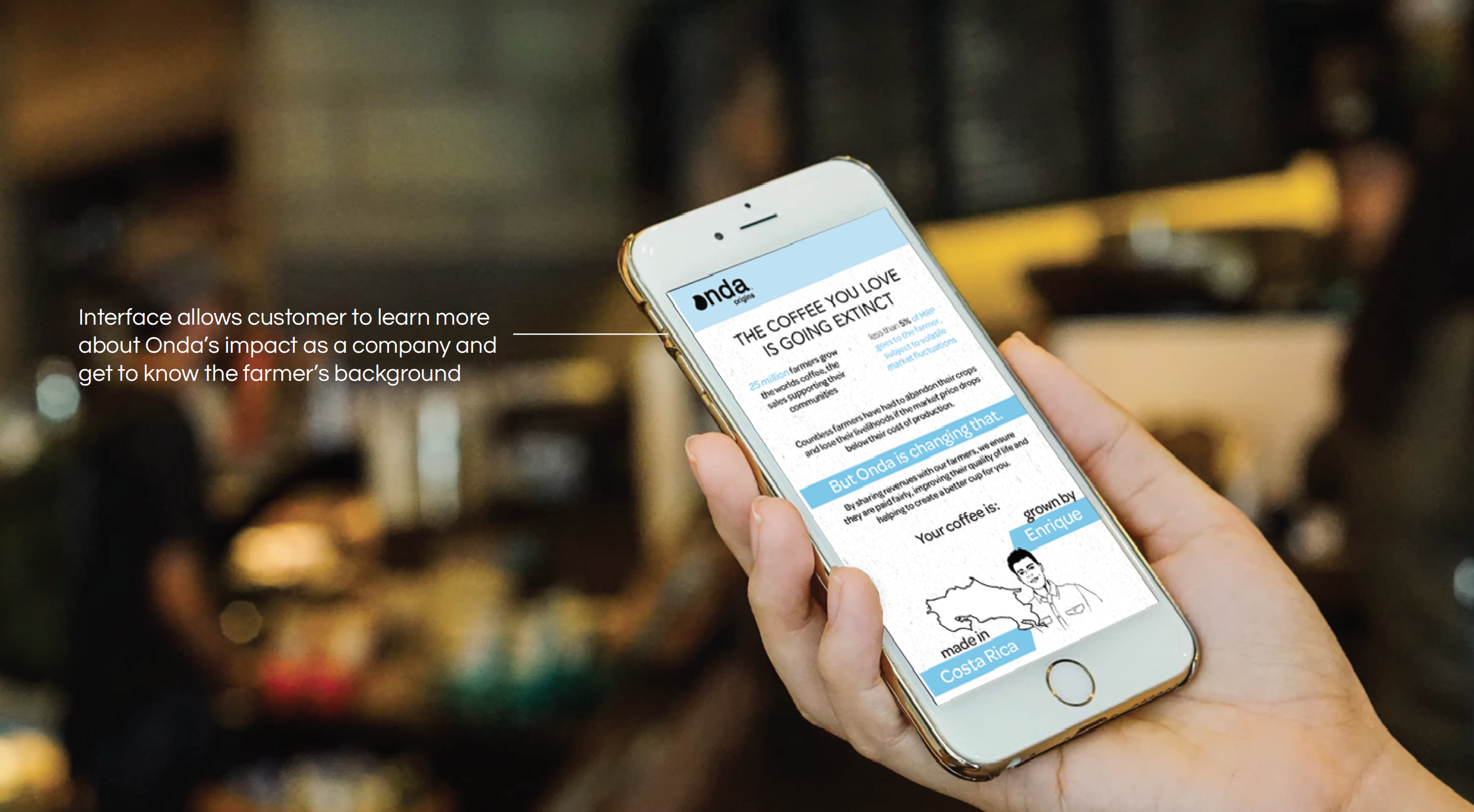
Mockup of Mobile Interface
☕️ Thank you for reading! Hope you liked it a latte :)
Debreeze
Summer 2020 User Experience Design Internship
Duration
3 months (June 2020 - Aug 2020)
Role
User Experience Design Intern
3 months (June 2020 - Aug 2020)
Role
User Experience Design Intern
Tools
Figma, Confluence, Jira, Miro
Figma, Confluence, Jira, Miro

Over the Summer of 2020 I interned at a design agency called Debreeze Interactive. I cannot disclose the details of the project that I worked on. But I can say that I worked with other interns developing mobile mockups and establish both user and business needs for an upcoming fintech product.
If you are interested in learning more, please feel free to reach out to me!
Voice User Interface (VUI) Design - Seattle Scavenger
Duration
3 months (Jan - Mar 2020)
Skills
User Stories, User Flows, Verbal Testing, Language, Auditory Feedback, Team Discussion
Number of Times Accidentally Activated Alexa
3
3 months (Jan - Mar 2020)
Skills
User Stories, User Flows, Verbal Testing, Language, Auditory Feedback, Team Discussion
Number of Times Accidentally Activated Alexa
3
Team
Samantha Chow, Hayden Hong
Tools
Miro, Figma, Voiceflow
Samantha Chow, Hayden Hong
Tools
Miro, Figma, Voiceflow
Design Process
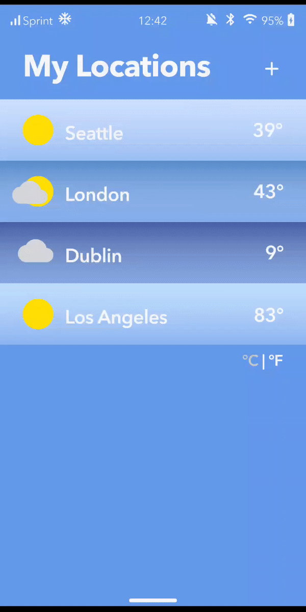
![]()

00 - Voice Design
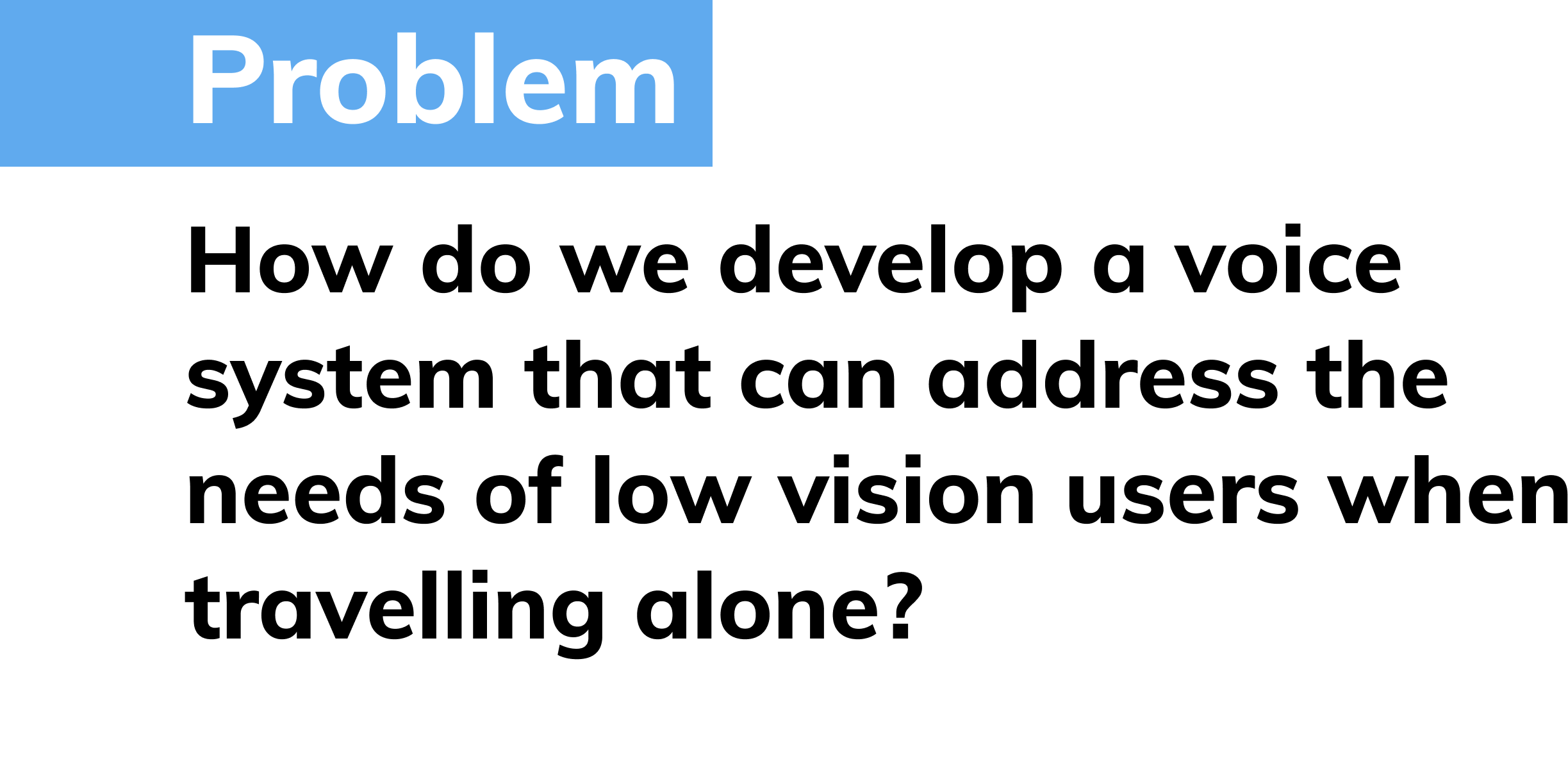
The goal for this project was to learn and understand how voice systems can provide a new and feasible form of accessibility. Low vision users are a direct target audience that can benefit from this greatly.

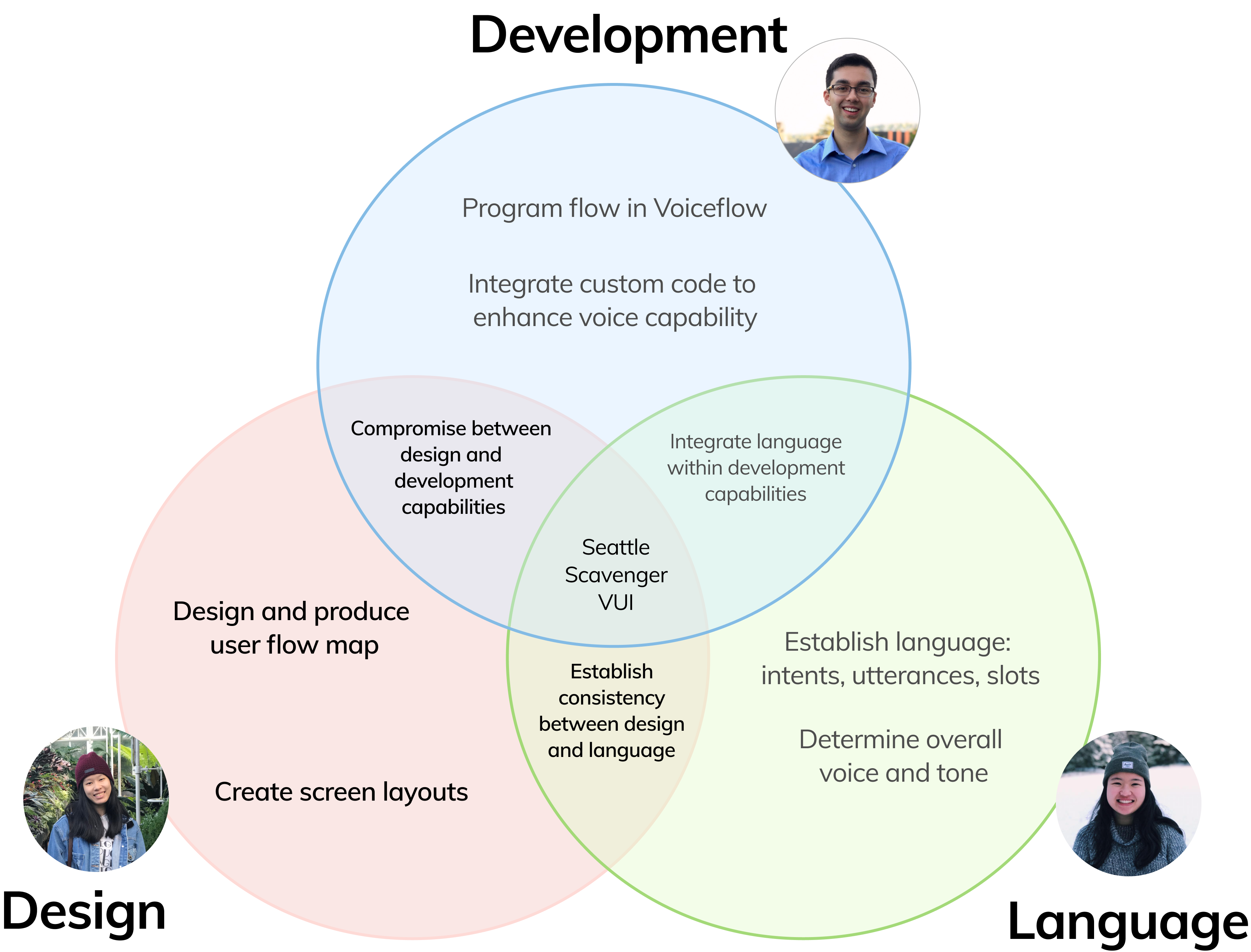
01 - Role
Within our team, we established distinct roles and tasks that would fufill both the technical and linguistic needs of the project.
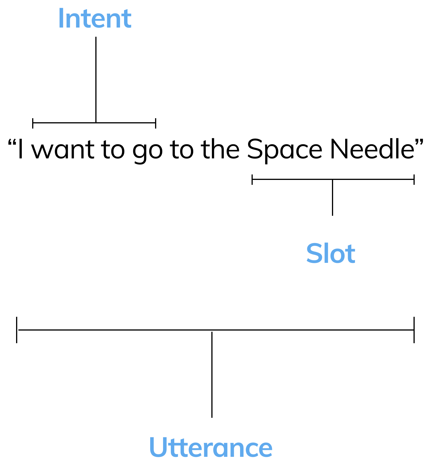
02 - Slots, Intents, Utterances oh my!
For the first couple of weeks, we learned how voice systems and voice commands are broken down. This helped us understand how to format language and wording when building our system.
03 - Voice Principles
We then developed principles to give our voice system a personality.
What should our voice system sound like?
Flexible
Provide variety of different options for user
Concise
Give clear information that’s easy to understand
Informative
Information given is helpful to user
What should our voice system sound like?
Flexible
Provide variety of different options for user
Concise
Give clear information that’s easy to understand
Informative
Information given is helpful to user
04 - Tone Principles
How should our voice system talk?
Friendly
Voice system is easy to talk to
Supportive
Present with the user every step of the way
Human
Conversing and speaking like a real human being
Friendly
Voice system is easy to talk to
Supportive
Present with the user every step of the way
Human
Conversing and speaking like a real human being
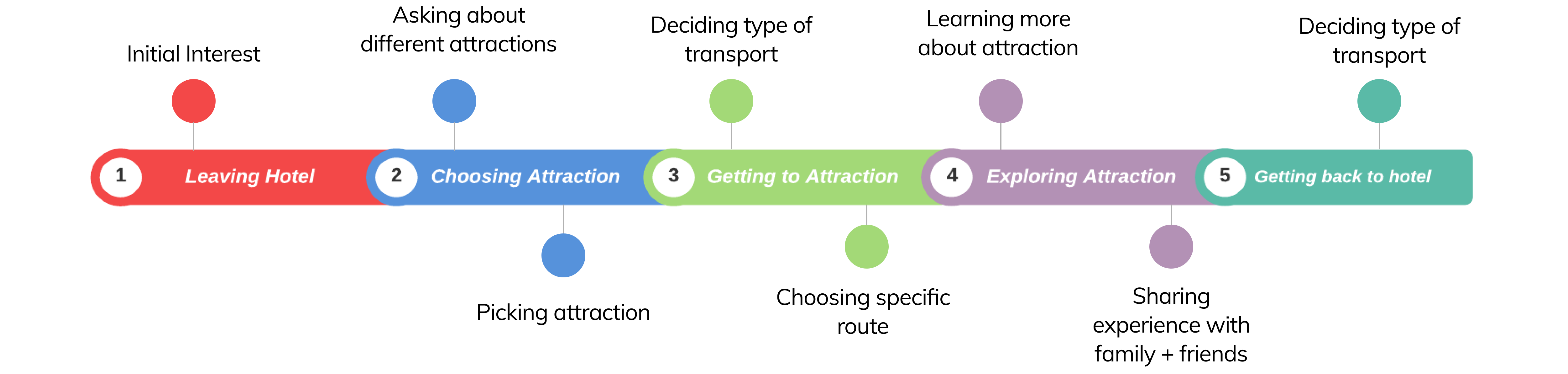
05 - Voice Points
I then plotted the different points when users would want to interact with the voice system.This gave us context in deciding certain use cases or situations.
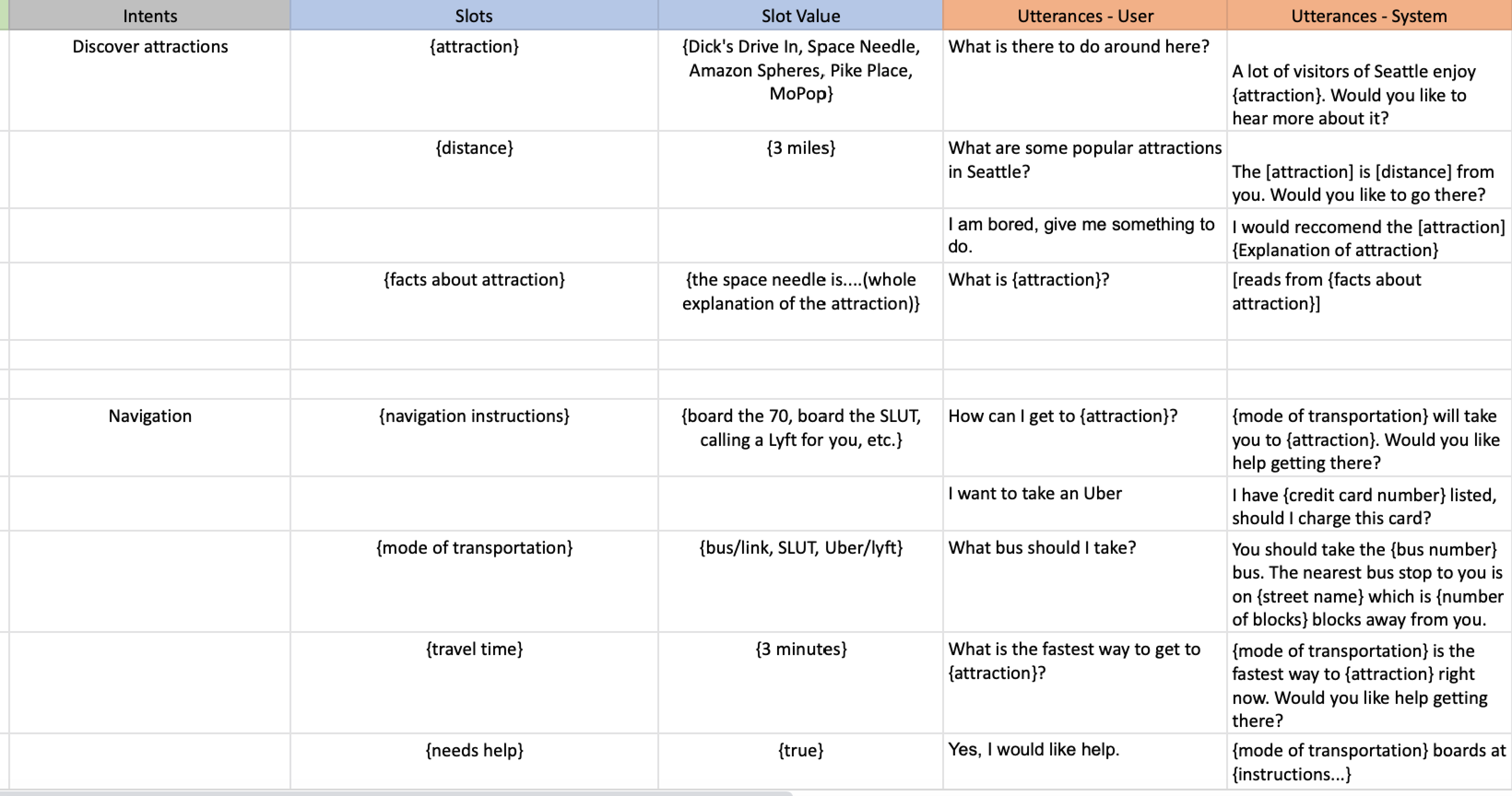
06 - Outlining Voice
Working with the team, we then planned out the slots, utterances, and intents that we would want to implement for every case study.
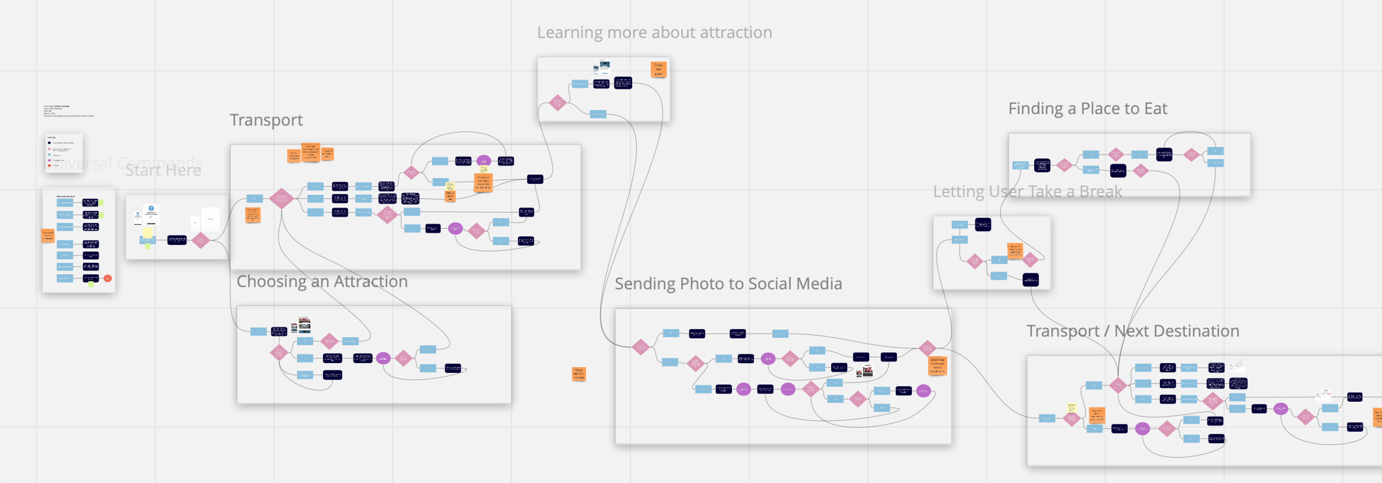
07 - User Flow
I then created several flows in Miro to plan out the different potential conversations and questions that users would interact with within the voice system.
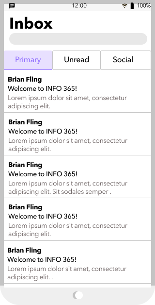
08- Wireframes
When building wireframes, I focused on having the most minimal content possible for maximum impact. I wanted minimal designs with a blocky structure to emphasize the user on listening and the visuals to act as supporting roles.
When building wireframes, I focused on having the most minimal content possible for maximum impact. I wanted minimal designs with a blocky structure to emphasize the user on listening and the visuals to act as supporting roles.

09 - Final Demo
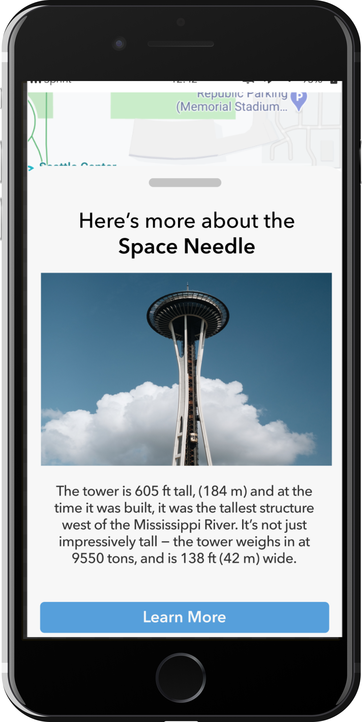
Pointing out Prosody
In this voice system, we want to ensure that your words are heard the right way. Based on location and activity, the voice system provides hints and context to help with your travel experience
“Tell me more about the Needle”
Do you mean the Space Needle?
Do you mean the Space Needle?
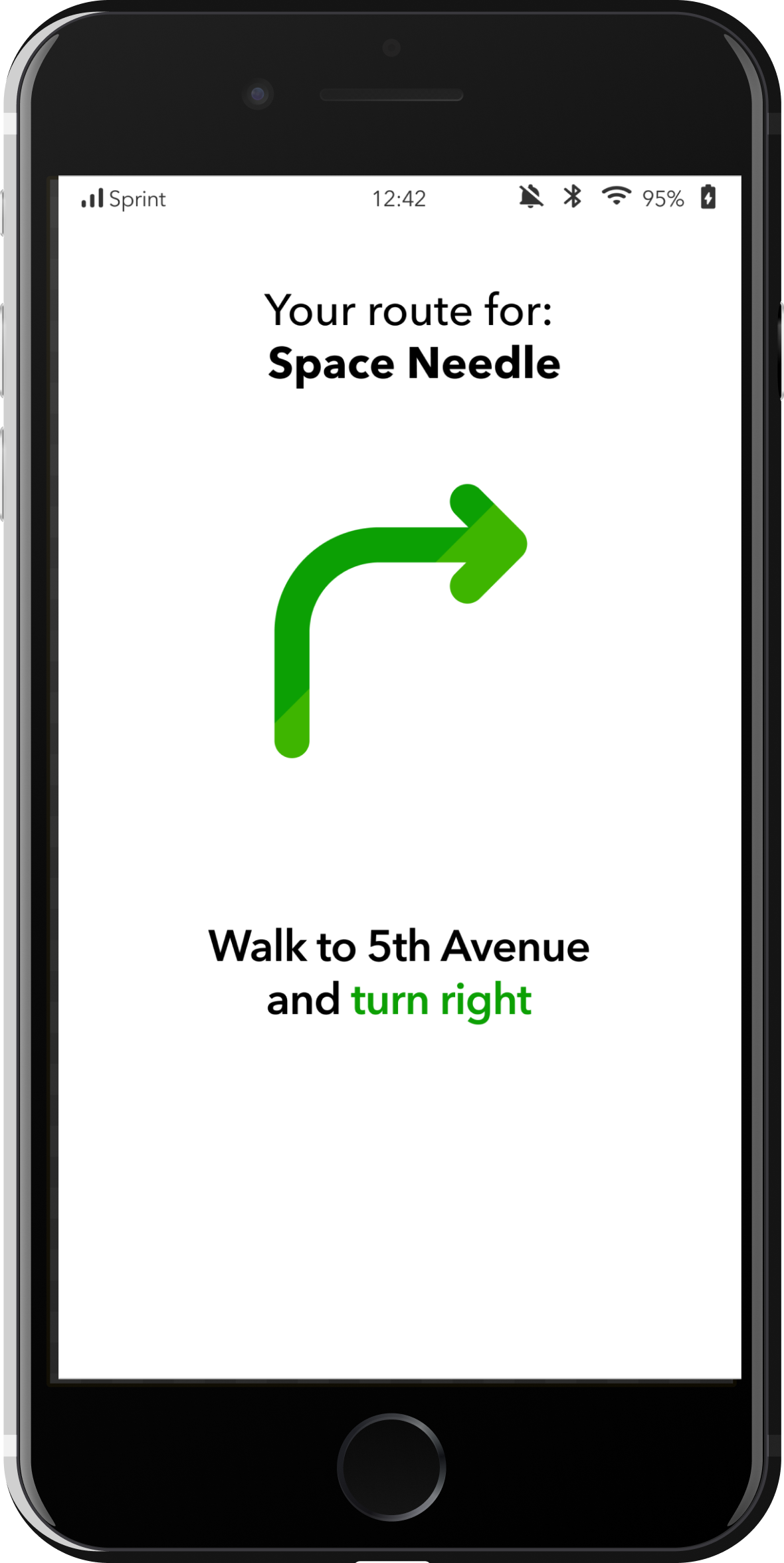
“Where is the destination?”
Take a right and walk for 3 minutes. The destination will be on your right
Take a right and walk for 3 minutes. The destination will be on your right
Having Adaptability
Your voice system acts as your virtual guide, ready to assist whenever you feel lost
Plan for Priority
No need to worry about finding new places.
By preparing different options, the choice is yours on where to explore.
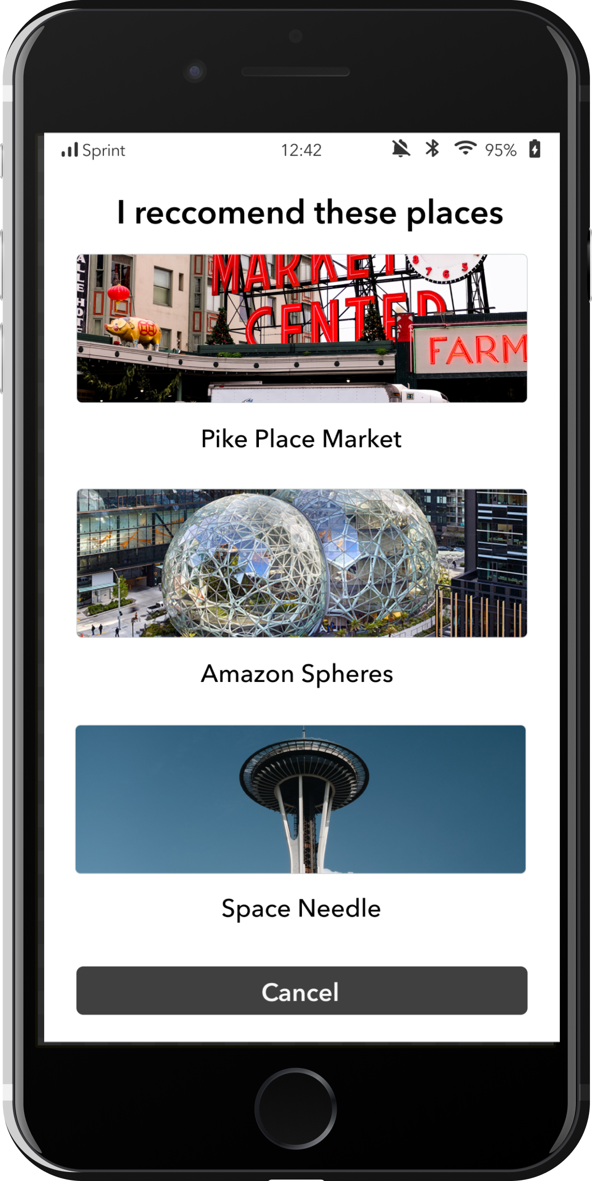
“What attractions are near me?”
The closest attractions near you are: the Pike Place Market, the Amazon Spheres,and the Space Needle
The closest attractions near you are: the Pike Place Market, the Amazon Spheres,and the Space Needle
10 - Video Demo
Design Systems - Solstice OS
A design system centered around balance and function

Duration
4 months (Sept - Dec 2020)
Skills
Whiteboarding, Sketching, Wireframing, Rapid Iteration, Team Discussion, Prototyping, Storyboarding, Visual Design
Team
Daniel In, Salem Gordon, Jacques DeBar, Hilton Vo,
Ajay Qi, Carmelito Guttierrez, Harini Gopal
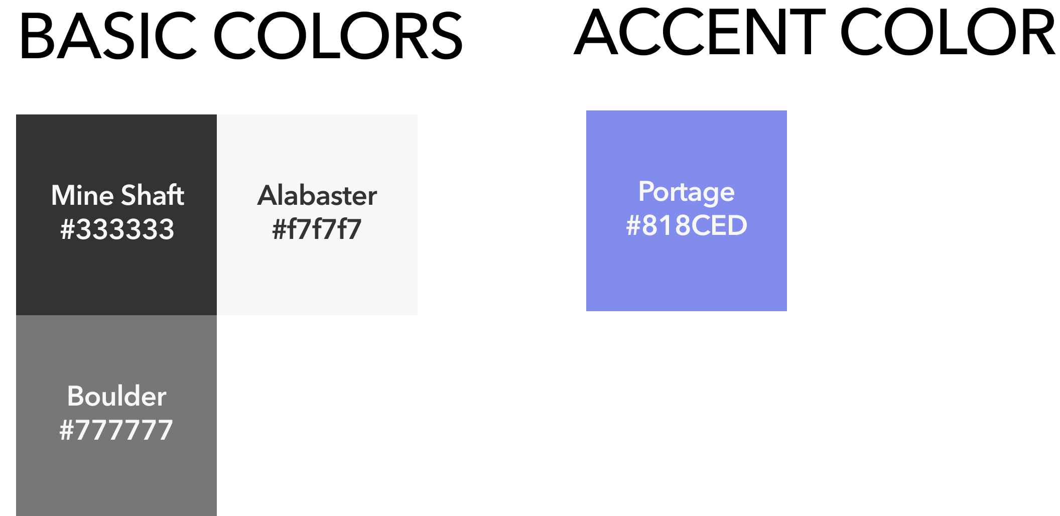
Signature Color
“Blurple” (Blue + Purple)
Design Process
![]()

00 - Why Mindfulness?
Our team explored creating a new OS centered around people having a more mindful and intentional relationship with their device, being able to help users reach their high points and support them through their low points, making way for Solstice.
01 - Research
When initially scoping the frame of our OS, we conducted interviews and went through several literature reviews to identify two main pain points associated with mindfulness and intentionality.
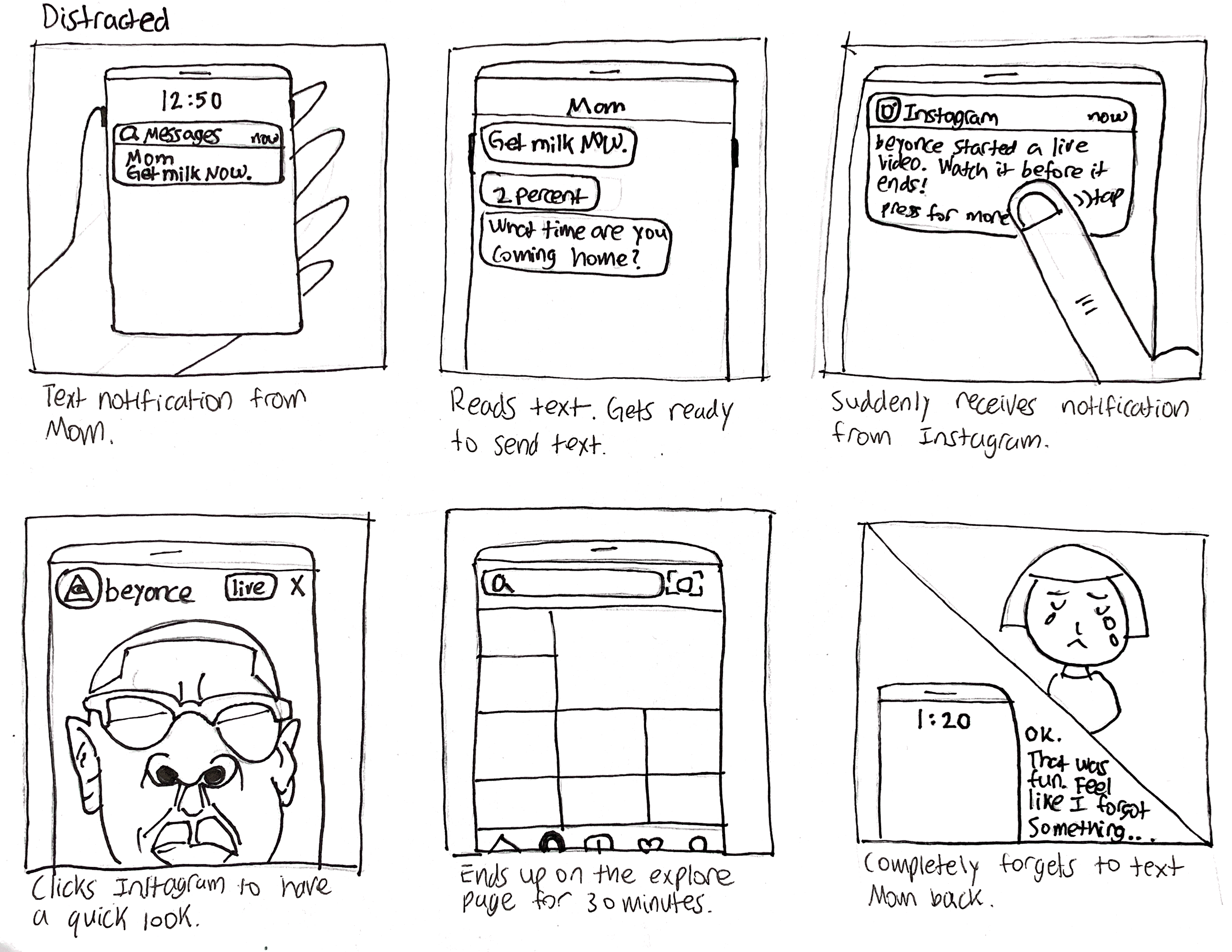
DISTRACTION
Something that prevents someone from giving their full attention to something else
DISTRACTION
Something that prevents someone from giving their full attention to something elseINFORMATION OVERLOAD
An excessive amount of information02 - Storyboarding
After establishing the pain points, we created two storyboards conveying user stories that illustrated how these pain points are shown in daily use
![]()
![]()
03 - Main Concept
Tab Switching
The main feature that we focused integrating into our design system was versions of tab switching. This isn’t a novel concept, but we felt that this fit best with the minimalistic and mindful concept that we were going for.

04 - Ideation Sprints
We would spend every 2 weeks dividing up a specific set of deliverables that were due in that period. The majority of the time was spent creating low-fidelity wireframes mostly through sketching and white boarding, getting continuous feedback from our peers and mentors.
05 - Wireframes
During the wireframing process, we had to iterate quickly and make executive decision on the overall look and feel for each app throughout the process, coming up with unique features that would make each app stand out and align with our concived design language.
05 - Design Principles
Personal
Promote unique experiences specifically tailored to each user behavior and interactionClean
Solstice is minimal and sophisticated with a visually consisten aestheticVisually Minimal
Give users the power to create their own mobile environment in a subtle fashion06 - Visual Language

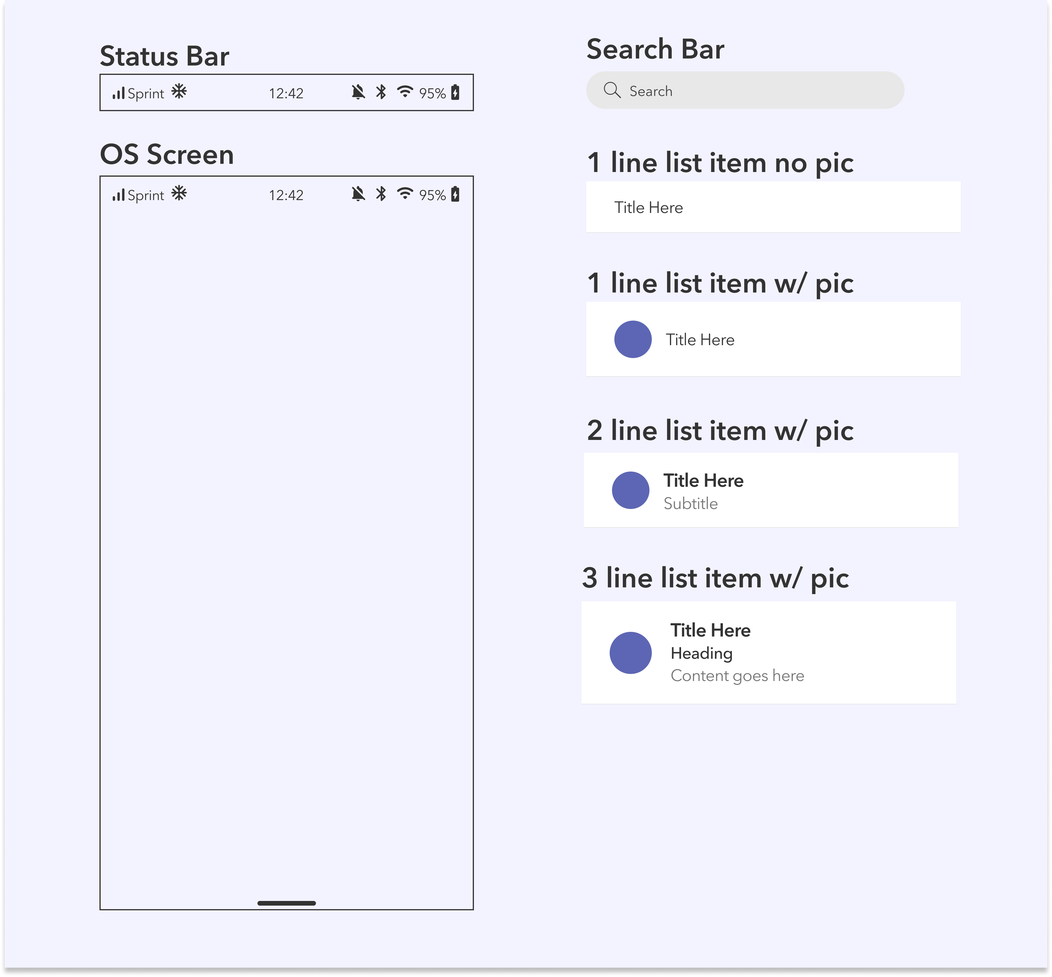
07- Components
We made these core components within the Figma library, so that designers can rapidly iterate and create mockups while adhering to the design language.
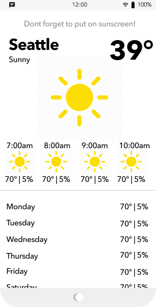
SOLSTICE helps you reach your high points and
supports you through your low points.
It promotes healthy relationships with your device
SOLSTICE helps you reach your high points and
supports you through your low points.
It promotes healthy relationships with your device
supports you through your low points.
It promotes healthy relationships with your device
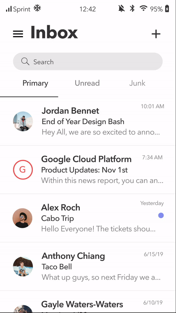
Put it on your Tab
By integrating categorized Tab Switching, users can filter through their emails, messages and texts with ease


Recent Contacts
Gain the access of your recent contacts without having to go searching for them
Weather
Putting the most important information first, for your viewing pleasure